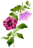
I actually downloaded a couple templates I found and I thought I was looking at a preview - but I found out that I did not. I actually published the template to become my new layout.
I like it better than the previous one, but there are a few things that I would like to change if I could just figure out how to do it.
I do not like the comments up on top, but I prefer them on the bottom (that is when you leave comments, right, when you are done with reading the post). Does that bother you?
I also think that the text is a bit small. But the next size up does not fit with the title's size at all.
Also, does anybody have a good understanding of how Blogger works? Or a good site or book to recommend? I feel like I need an IT class.....


October 22, 2010 at 10:26 PM
I do like the header, it's cute! You should search for a blogger tutorial. I'll bet you can find one online.
October 22, 2010 at 11:12 PM
The size of the text IS small -- I had that trouble with my own blog and finally saw that I could click "normal" in the text size and it fixed it -- have you tried that? Overall I do like the fresh look! Isn't playing around with blog layouts fun? I change mine all the time!
October 23, 2010 at 10:45 AM
I love the new look! The header is great. I had a play around recently and I think if you go into design and text size you can change it to normal, like Lori says. I know what you mean about the Comments box though - I prefer them being down at the bottom but I think that's just because of what we are used to. I just bought a book which I've found quite useful - Blogging for Bliss by Tara Frey
http://www.amazon.co.uk/Blogging-Bliss-Tara-Frey/dp/1600595111/ref=sr_1_fkmr1_3?ie=UTF8&qid=1287823378&sr=8-3-fkmr1
See what you think!
October 23, 2010 at 11:16 AM
Thanks for your comments ladies. The text is already set to normal - and if I change it to large it becomes was larger than the titles.
I found this in a site who offers free blogger templates. I tried to move the comments link to the bottom (I know you can do that in the standard blogger templates) but the function isn't available here. So for now I think I will have to go with what it is right now, since I do know nothing about html programming. Thanks for hanging in.
October 23, 2010 at 11:51 AM
Gefällt mir gut - aber für mich alte Frau, die ich langsam werde, ist der Text tatsächlich etwas klein. Ansonsten finde ich sieht es wirklich gut und frisch aus.
October 23, 2010 at 5:16 PM
I like it a lot! Love the colors!